- Digital
Verizon Visa Site
Pushing the boundaries of digital movement and breaking the mold with our fluid one-page experience for Verizon Visa Card.

One card. One page. Endless possibilities
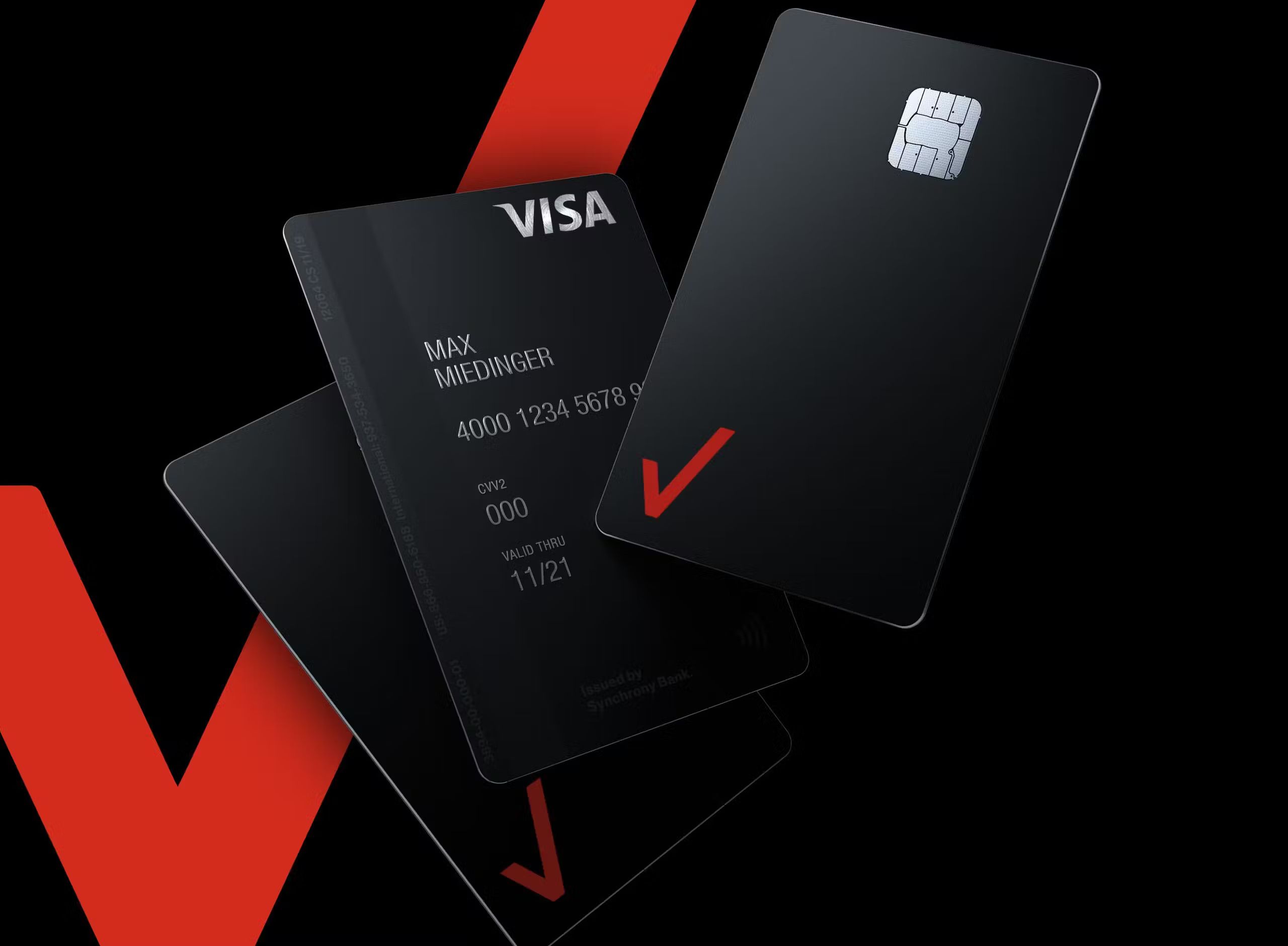
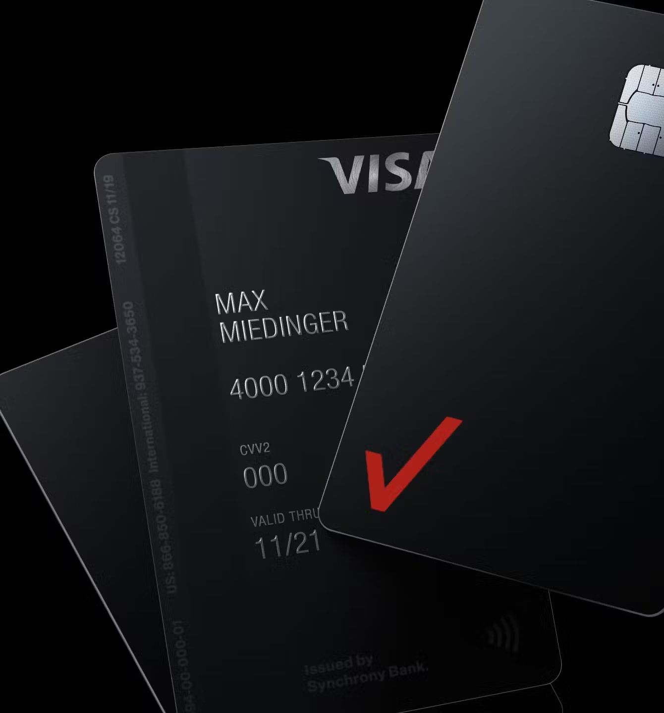
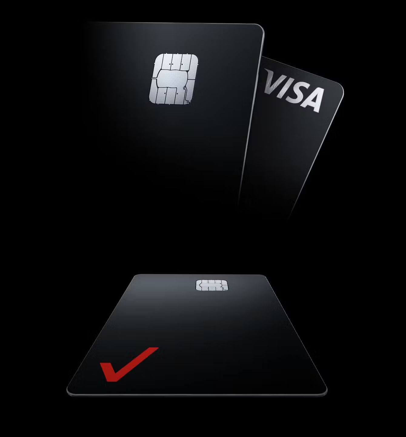
We created a one page experience to introduce the new Verizon Visa card, the first credit card designed with mobile customers in mind. Savvy customers deserve savvy design, which is embodied in the clean, crisp Verizon look and website.
Loosey goosey, baby
With a focus on *swish* 3D design, we created the look, animation and lighting of the digital card, allowing it to fluidly move and transition through the page. The card details were integrated with the page scroll, giving a cohesive and effortless experience for the user. Nice.


Outcome
Verizon hasn't told us how many applications they have processed via the site, but we're guessing it's somewhere in the range of a bajillion.
