- Digital
Adobe Consonant
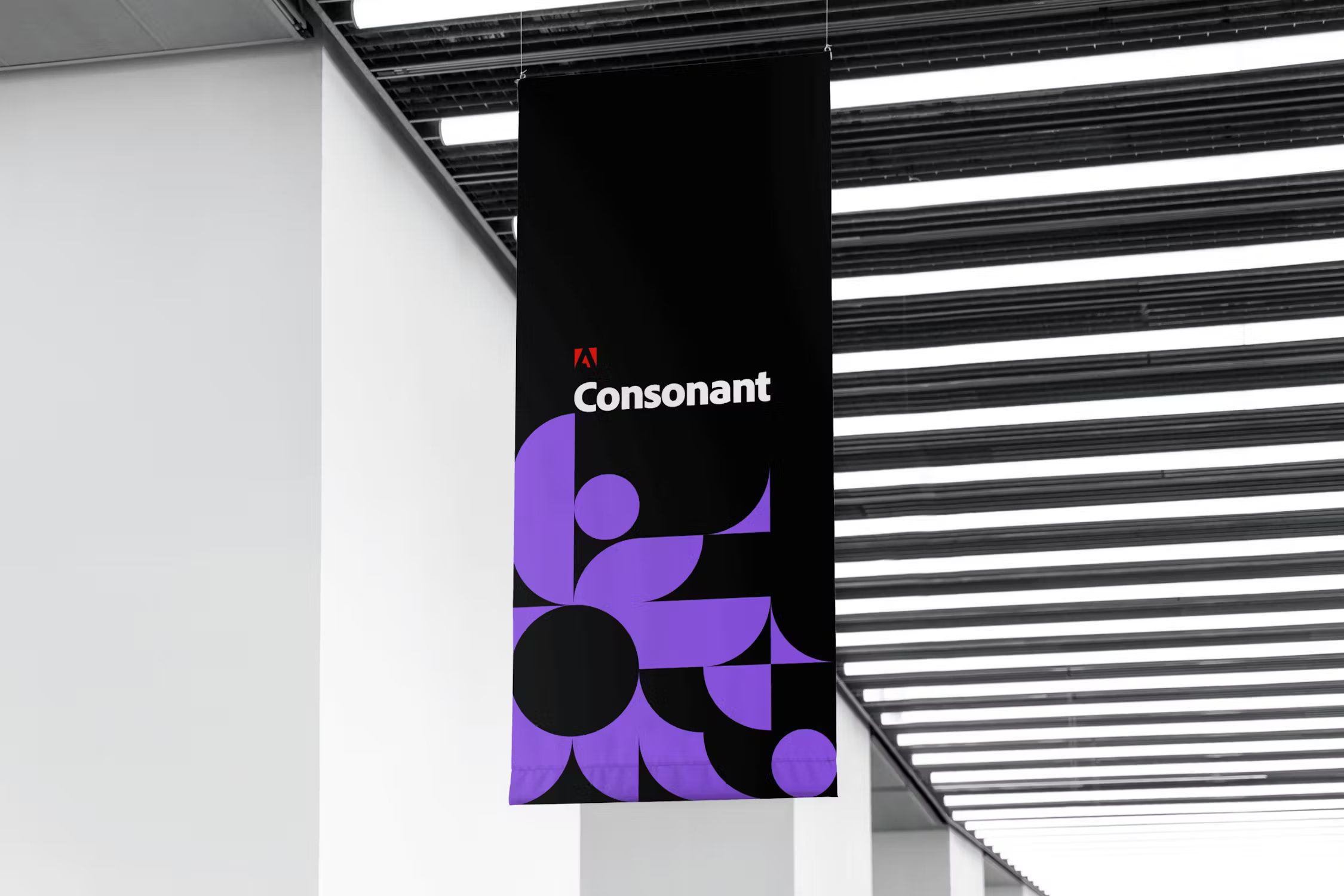
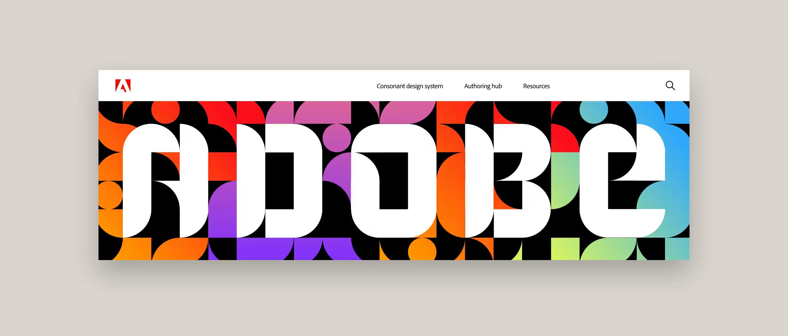
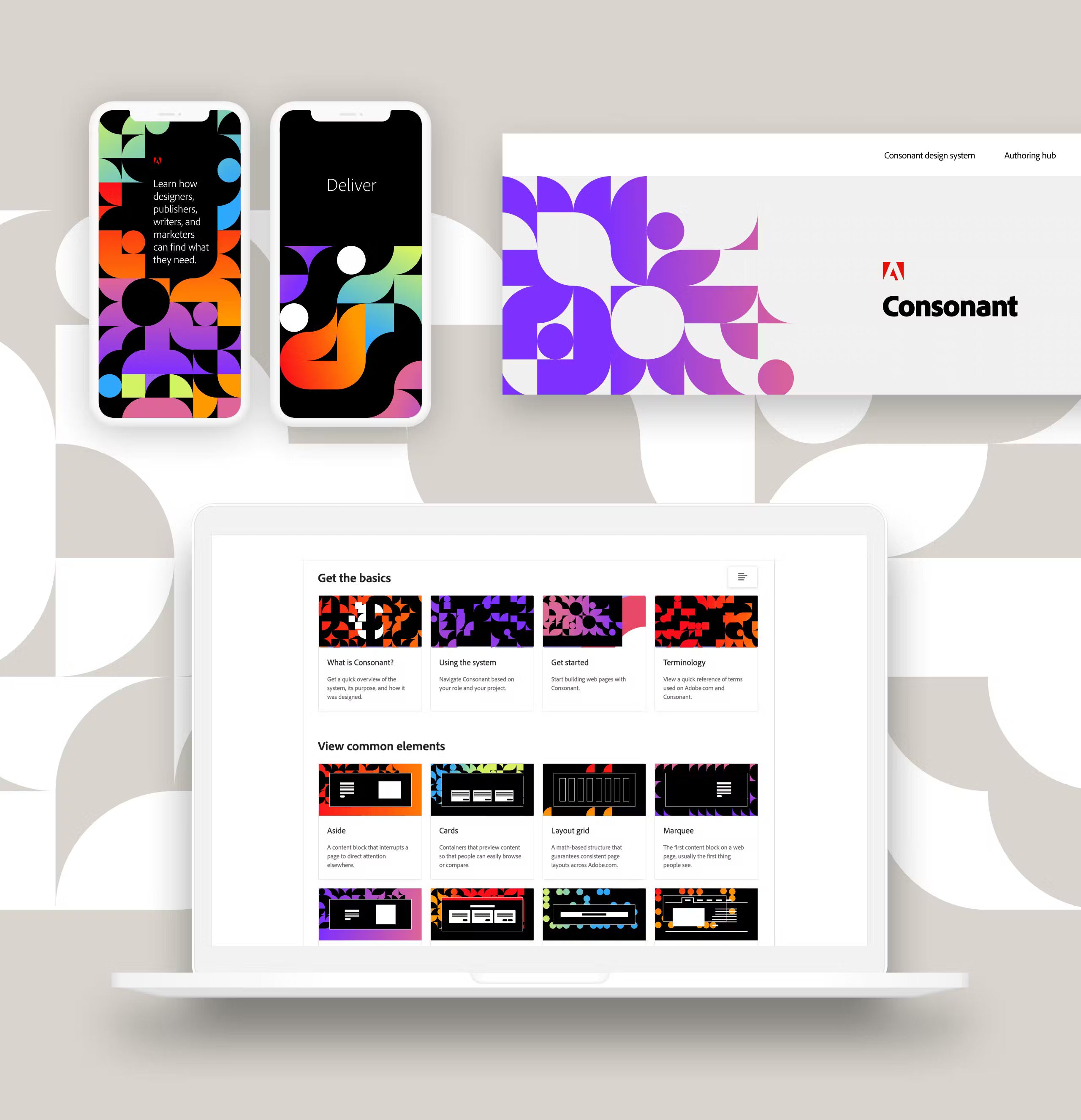
During our long standing partnership with Adobe, we have worked on the Consonant design system for over 3 years, but it was time for a refresh. The brand was in need of a new inspiring look and feel that was representative of the system’s momentum.
Reinventing for Growth
Looking to the future for Adobe Consonant meant not going rogue with a whole new identity, but rather to make a statement through simple, strategic design. An elegant and minimal approach was taken with delicacy yet promised impact.

Thoughtful Design, Deep Experiences
Evolving a brand’s creative identity is a fun balancing act of pushing the boundaries, while finding restraint when needed. It was important to propel the creative forward while remaining true to its established brand.



From site to brand and beyond
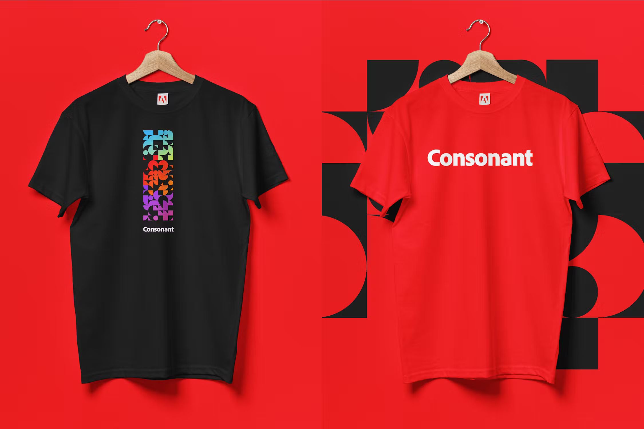
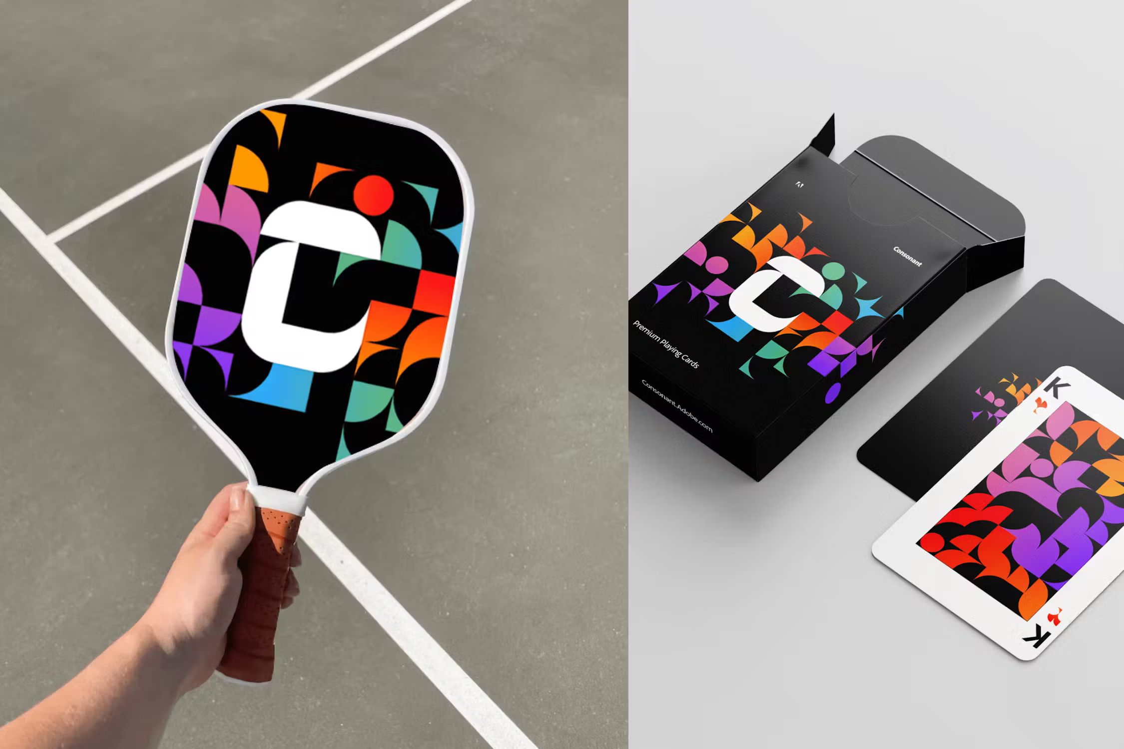
Our development of the brand system created the consistency and quality Adobe needed to align their team as they rolled out their system design across Adobe.com.


